The Best (and Worst) Colors for a Sleep Environment
Discover the best and worst bedroom colors for deeper sleep. Simple design tweaks can boost rest, recovery, and mental clarity—fast.
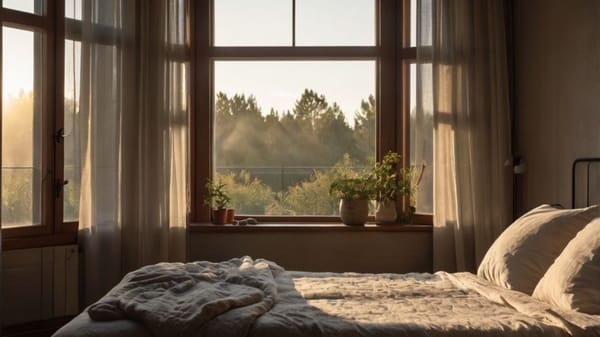
What if the secret to better sleep wasn’t in a pill or an app—but in your bedroom walls? Color doesn’t just decorate your space—it shapes your brain’s ability to rest, recover, and recharge.
The right shades can ease your body into sleep mode, while the wrong ones keep you wired. Before you buy a new mattress or track your REM, take a look around. Your color choices might be doing more than you think.
Why Color Affects Sleep (and Why You Should Care)
Color impacts your physiology. That’s not woo—it’s neuroscience.
Your body’s internal clock, or circadian rhythm, reacts to environmental cues. Light is the main driver, but color plays a surprising supporting role. When your brain sees certain hues, it links them to emotion, memory, and safety signals.
Cool tones like blue and green reduce heart rate and lower blood pressure. Warm, bold tones can do the opposite—they ramp up energy, increase alertness, and make it harder to relax.
Your bedroom should be helping your body switch into recovery mode, not pushing it to stay alert.
Think of it this way: color is emotional shorthand. You feel something before you even process it. That feeling can either move you toward deep rest—or push you further from it.
The Best Colors for Your Sleep Environment
Not all calming colors are created equal.
Some do more than just look relaxing—they actively support the mental and physical conditions needed for high-quality sleep. Let’s break down the shades that actually deliver when it’s time to wind down.
Soft Blues: The Gold Standard of Calm
Soft, dusty blues are top-tier sleep colors for a reason. They mimic the sky at dusk or clear water—two natural cues of peace and stability.
In sleep psychology studies, participants exposed to blue bedroom environments often experienced longer and more consistent sleep.
But not all blues are equal. Avoid anything too bold or neon. Go for hues like:
- Sky blue
- Powder blue
- Slate blue
These shades promote a sense of security and predictability. And when your brain feels safe, it lets go faster.
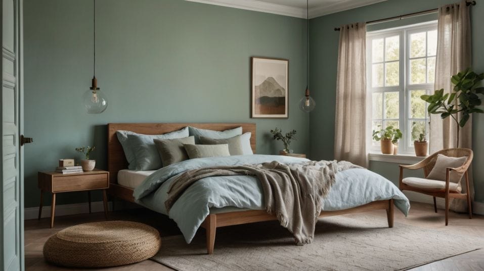
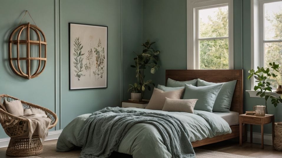
Earthy Greens: The Unsung Hero of Restful Spaces
Natural greens, especially those pulled from plants and forests, create a soothing, grounding effect.
They suggest growth and recovery without overwhelming your senses. These shades work especially well in rooms that get natural light during the day—they transition beautifully into evening without becoming dull.
Think:
- Sage
- Olive
- Eucalyptus
- Moss
Layering these with natural materials—wood, linen, stone—amplifies the calming vibe.
Lavender & Mauve: A Gentle Balance
Lavender walks the line between cool and warm tones, which makes it an ideal option for people who want a bit more personality without sacrificing serenity.
This soft purple hue has been linked to lower anxiety levels and reduced nighttime restlessness.
Pale mauves and dusty lilacs also fall into this category. They still signal “calm,” but with a subtle warmth that keeps the room from feeling sterile or too cold.
Warm Neutrals: The Safer Side of White
You don’t need bold color to make your bedroom sleep-friendly. If you love a neutral palette, focus on creamy, warm whites and soft beiges. These keep the room light and airy without the harsh brightness that comes from stark whites.
Look for:
- Ivory
- Greige (gray-beige hybrids)
- Soft taupe
These shades work particularly well in small spaces or rooms without much natural light. They brighten without overstimulating.
Colors That Disrupt Sleep (Even If They Look Stylish)
Just because a color looks good in a magazine doesn’t mean it belongs in your bedroom. Some popular shades might be trendy, but they work against your brain’s ability to switch into rest mode. Here’s where things start to go off-track.
Fire-Alarm Shades: Red, Orange, and Bright Yellow
These colors aren’t “bad”—they’re just not for the bedroom. Bold, saturated reds and oranges stimulate your sympathetic nervous system. They activate your fight-or-flight response, even in small doses.
You may love the look on Instagram, but in real life? These colors make it harder to fall asleep and easier to wake up during the night.
Stark White and Cool Gray: Too Cold, Too Clinical
Pure white reflects light more intensely than any other color. That’s not what you want when you’re trying to calm your brain. It can feel sterile and artificial, especially when paired with bright overhead lights.
Cool grays—especially those with blue or silver undertones—can have a similarly negative effect. In daylight, they might look modern and clean. At night, they often read as gloomy or emotionally flat.
If you’re set on white or gray, soften it. Add texture. Warm it up with wood accents, soft fabrics, or a warmer-toned light bulb. Avoid glossy finishes—they reflect too much light and add to the harsh effect.
How to Apply This in Real Life (Without a Major Redesign)
You don’t need to repaint your entire bedroom tomorrow. Small changes still move the needle.
Start by choosing one or two key elements to shift:
- Bedding: A eucalyptus green duvet or lavender sheets can change how your brain processes the space.
- Curtains: Swap out stark white blinds for sage or warm beige blackout curtains. You’ll block out more light and improve the room’s tone.
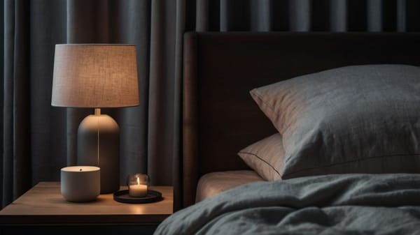
- Lighting: Color only works if your lighting supports it. Use warm, low-temperature bulbs at night. Think 2700K or lower. Skip the harsh overheads and opt for bedside lamps with soft filters.
- Accent pieces: Artwork, throws, rugs, and even lampshades all contribute to the emotional impact of the room. Stick with calming palettes across the board.
The goal isn’t perfection—it’s progress. If your space looks and feels more relaxing, your brain will follow.
Final Thoughts
Color is more than just style—it’s a shortcut to better sleep. Stick with calming shades like soft blues, muted greens, gentle lavenders, and warm neutrals.
Avoid bold reds, fiery oranges, and harsh whites that keep your brain on high alert. Your sleep environment should whisper “rest now.” Not shout “stay alert.”
You don’t need a total overhaul. Start with one change—a new duvet, a soft wall color, better lighting—and build from there. Every small upgrade moves you closer to smoother, deeper sleep.
Start now. Your body already wants to rest. Set up your space to help it do just that.